VTK Designer
I just got a mail from Prashanth Udupa informing me that a release candidate of VTK Designer 2 has been made available. I've tried VTK Designer a few times in the past months. Despite this, each new version surprises me. This application is really cool, both when looking at the technology and visually. More interesting to fellow Qt developers is that the user interface feels really solid, but also provides a whole bunch of quite advanced widgets.
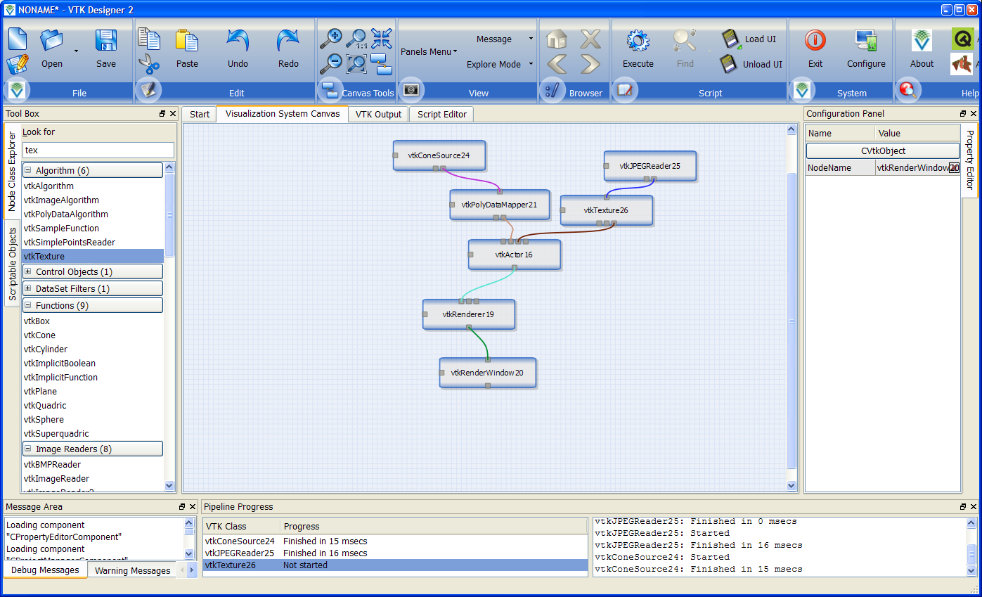
Just looking at the screenshot above, you will see a professional looking expandable tree to the left, a graphics view showing a bunch of interacting objects in the middle and a the top - like it or not - the newest kind of toolbar as introduced in the last incarnation of Office.
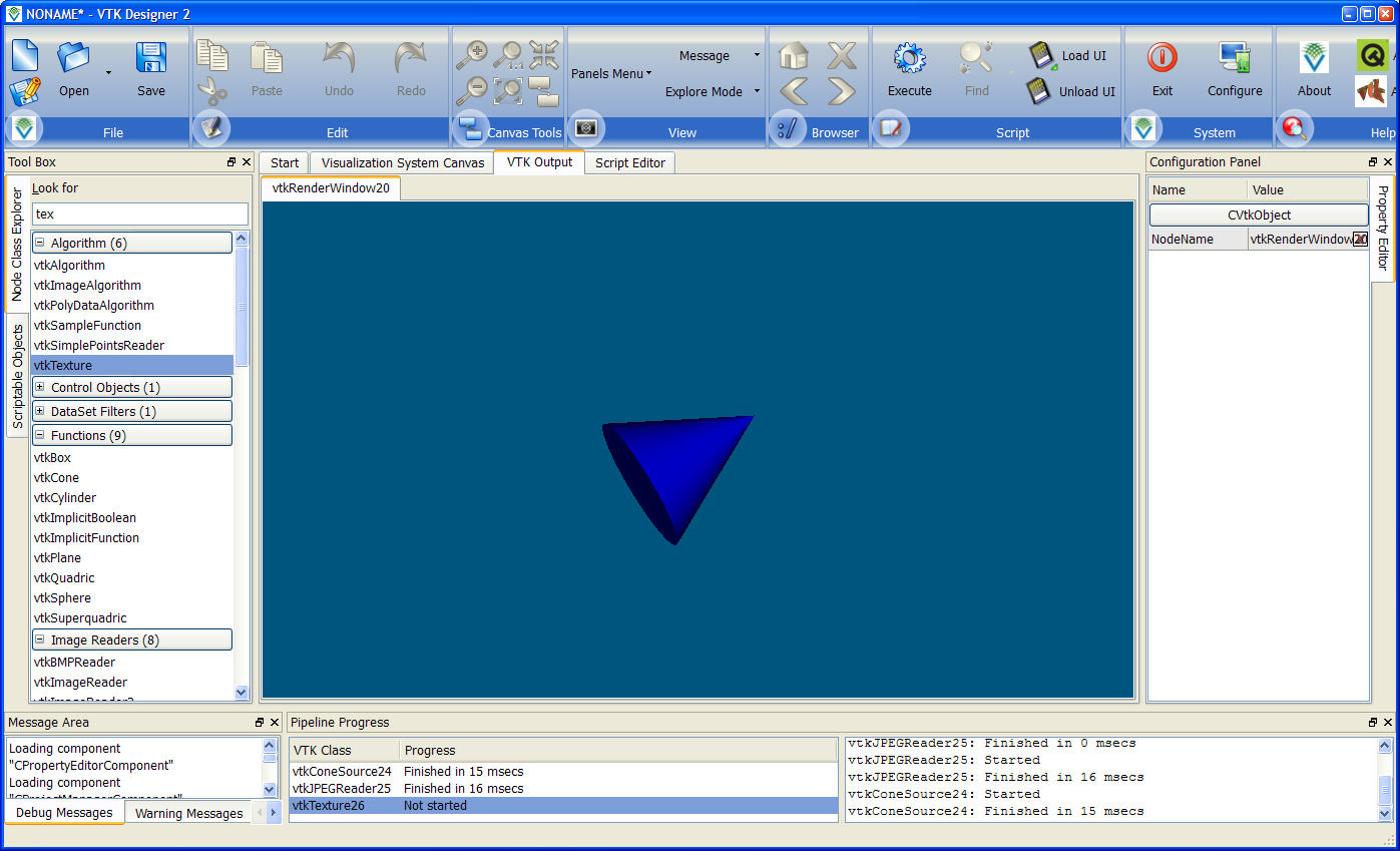
Switching tab in the work area reveals the visually pleasing part - a live VTK rendering. The view can be rotated and turned around - live. Apparently, for those of you with a bigger gadget account than me, it also supports haptic input. This means that you can actually feel and prod at objects in your scene. For those of you interested in more than my basic screens - check out the video.
posted by Johan Thelin @ 18:12
2 comments
![]()


2 Comments:
OMG that UI is a horrible mess.
First, the new toolbar. It's nice and all, but it shouldn't *replace* the main menu. It should be a replacement for a "standard" toolbar, there should always be a menu for fallback. But at least it doesn't have tabs like MS products, these tabbed toolbars drive me nuts because I don't find anything on them that's more advanced than "copy" or "paste".
Second, the Toolbar is cut off on the right. It's not hard to imagine what happens when you make the window smaller. Combine that with the missing menu and you get a lot of inaccessible commands.
Third, tabs-inside-tabs (on the second screenshot) were already proven evil a long time ago.
I would say the UI *looks* shiny on the outside, and for someone taking a quick look at it. But if you look more closely, it's an actual nightmare...
--Darkstar
First of all it is nice to receive a good comment set about the UI. Now for some responses..
The New Toolbar: there is a menu fallback, if you click on the icons against each group you will see a pull down menu. Maybe I should link it up with Alt+() accelerators.
Second: You can scroll the toolbar to the left or right using the mouse wheel or by clicking on the group titles and dragging it to the left or right.
Third: Fully agree with you. Will be replacing it with something better in a future update.
Post a Comment
<< Home